One system, one conversation. Designing LowerOS for borrowers and the people who guide them.
Company
Lower, a technology-powered mortgage company
Timeline
2 years (2024–2026)
My Role
Senior Product Designer. Sole designer across the product
Context: Two Big Bets
Lower takes big swings. In the past two years, the company made two technology-focused acquisitions that define its strategy.
The first, at the end of 2024, was Neat Labs. A company that built proprietary mortgage technology. Over the past two years, the team has been building customized workflows on that foundation to reduce costs and increase the speed of the mortgage manufacturing process. Internally, that platform is LowerOS: the system Lower's staff works in every day.
The second, in 2025, was Movoto. A national real estate search company (similar to Zillow). Where Neat Labs was a bet on the technology behind the loan, Movoto was a bet on owning lead acquisition and the customer-facing experience end-to-end.
Together, these bets serve one vision: a fully digital mortgage. A borrower moves from home search to close without friction, digital where software is faster, human where judgment and trust matter.
I sit at the intersection of both bets. I own the borrower-facing and loan-officer-facing experiences, which means designing for two users at once:
Borrowers who want to know two things quickly. “Am I qualified, and what will it cost?”
Loan officers, the staff guiding them there. They need one system that lets them advise instead of administer.
This case study is about the seam between those two users. What happens when you design it as one workflow instead of two products?
The Problem
A mortgage at Lower ran through too many systems, and both users paid for it. The guided experience had four problems to solve, in priority order:
Speed, for loan officers. LOs worked across multiple systems, including CRM, credit, pricing, and the legacy LOS, and it took multiple calls to deliver an offer to a borrower and get their commitment to move forward.
Speed, for borrowers. Borrowers want to know whether they're qualified and what their rate is. Getting those answers took multiple conversations with a loan advisor.
Onboarding. The systems loan officers used were not intuitive. Onboarding new staff was slow and required a high level of specialized training before they were productive.
Repetition. Borrowers had to repeat themselves throughout the process — about income, assets, property, credit, and goals — which is frustrating and erodes trust.
The repetition problem shows how the whole system broke down:
A borrower would start in the consumer funnel on Lower.com, filling out a short application. That data landed in a CRM. When a Loan Officer picked up the lead and called, they couldn't see a complete picture of what the borrower had already shared. So they re-asked. When the loan moved into the legacy loan origination system, fidelity was lost again. Every system hop created another opportunity for the borrower to hear a question they'd already answered.
The cost wasn't just an annoyance. Repeated questions erode trust at the exact moment a borrower is deciding whether to commit to the largest financial transaction of their life. They slow the first call, and they produce incomplete applications that generate downstream fallout for processing.
The core problem: the borrower experience and the staff experience were designed separately, in separate systems. Fixing either one alone patches a symptom. LowerOS was the opportunity to design them as one connected workflow. Collect the borrower's story once, keep it intact, and put it in front of the loan officer at the moment they need it.
Learning the Domain First
As the only designer on this work, I couldn't design from the screen inward. I had to understand the whole machine: how a lead becomes a loan, where soft and hard credit pulls happen, when pricing runs, how automated underwriting fits in, what disclosures require, and where the handoffs between systems actually break.
I built that fluency deliberately:
Shadowing and working sessions with Loan Officers to understand how the first call really works — what they ask, in what order, and what they scribble in notes because the system has no place for it.
Partnering directly with executive leadership. The one-call workflow is a company-scale process change, and process changes of that size live or die on executive buy-in. I worked directly with our Chief Revenue Officer to understand his vision for transforming how his sales organization operates, and I led the workflow portion of a full-day on-site with him, his sales leaders, and our training team — walking the room from the current tangle of systems to the future-state one-call flow, and distilling the vision the whole program would build against.
Discovery sessions with operations teams (fees, pricing, processing) to map pain points beyond the application itself.
Studying call transcripts and demos to hear the borrower conversation as it actually happens, not as the org chart imagines it.
A framing emerged from this research that shaped everything after: the application isn't a form — it's the borrower's story. Property, income, assets, liabilities, and goals are inputs to a story the Loan Officer needs to read quickly so they can make a strong recommendation on the very first call. The job of the system is to collect that story once, keep it intact, and put it in front of whoever needs it next.
A second insight came from borrower-side research: long questionnaires give borrowers no value until the very end. Breaking the application into modules creates moments to give something back — and gives the loan team flexibility in how they collect the rest.
Mapping the Ecosystem
Before designing screens, I mapped the territory. I created a set of end-to-end workflow maps covering three states:
Current state — consumer funnel → CRM → legacy LOS
Initial launch — consumer funnel → LowerOS, with the legacy system still handling post-disclosure work
Future state — the full journey inside LowerOS
These maps became the shared reference for product, engineering, and sales leadership. They surfaced the outstanding questions no one owned — when does a LowerOS loan get created? When is the borrower's account created? Which portal does the borrower log into? I put them in one place instead of scattered across meetings.
The most consequential piece was unglamorous: question-level field mapping. I mapped every question in the consumer funnel against every field in LowerOS to find the overlaps, the gaps, and the questions that didn't translate cleanly. This mapping is the actual mechanism behind "ask once" — you can't pre-fill what you haven't mapped. It also de-risked the integration: the team had already learned that LowerOS didn't always behave the way the funnel data assumed.
This work generated a prioritized backlog of integration line items — automatic borrower account creation, application export, dashboard refinement, consolidated borrower communications — that engineering scoped directly into delivery waves.
Ecosystem Maps
Current state — consumer funnel → CRM → legacy LOS

Initial launch — consumer funnel → LowerOS, with the legacy system still handling post-disclosure work

Future state — the full journey inside LowerOS

Designing the Flows
With the ecosystem mapped, I designed the borrower application flows around two service models Lower actually operates:
Fully digital self-service — a borrower moves from an ad to a mini-app to the full application, selects a loan, and uploads documents with limited LO support.
Digital with Loan Officer support — the borrower starts digitally, then works with an LO who answers questions, advises on loan selection, and guides them through submission.
Designing both side by side forced an important discipline: the data model had to be identical regardless of who was driving. Whether a borrower typed an answer or told it to their LO on a call, it landed in the same place — so no one downstream ever had to ask again.
To prove the continuity, I built a fully filled-out application prototype demonstrating exactly what carries through from the consumer funnel into LowerOS, and used it to run design reviews with engineering and product to validate the workflow end to end. The flow finished with real borrower value: completing the application generates a pre-approval letter, available right on the borrower dashboard.
The Guided "One Call" Application
The centerpiece of the LO-side work was the guided application — a live-call tool that lets a Loan Officer complete a full application in one structured, natural conversation.
What makes it work:
Pre-filled with everything the borrower already provided. Data from the consumer funnel and CRM loads before the call starts. The LO confirms rather than re-asks. This is the field-mapping work paying off.
Ordered like a conversation, not like a database. Sections follow how LOs actually talk to borrowers, with a stepper so they can move non-linearly when the conversation jumps.
Credit in one place. Soft credit from the funnel carries in; tradelines can be reviewed and adjusted live with the borrower — eliminating duplicate credit pulls and imports.
Edge cases designed, not discovered. Frozen credit scores, multiple jobs, self-employment, commission and bonus income, inline tradeline editing, monthly payment visualization with pricing implications.
The target: capture 90%+ of required information in a single call, with a clear definition of what could be deferred. Early feedback from loan teams was strongly positive on reduced friction and better borrower conversations.
I owned this end to end — prototype, specs, edge cases, engineering refinement, and stakeholder confirmation — including walking sales leadership through the designs and cycling their feedback back into the source of truth.Guided Application Exploration
Low-fidelity exploration.
This phase also produced one of the experience's signature transparency patterns: a persistent "Why are we asking?" explainer attached to property and financial questions, born from the research insight that borrowers disengage when a long questionnaire gives nothing back.
Initial assumptions that were being tested is having a ‘Primary Application’ for a borrower with follow-up modules to be completed after submitting and talking to a loan officer.
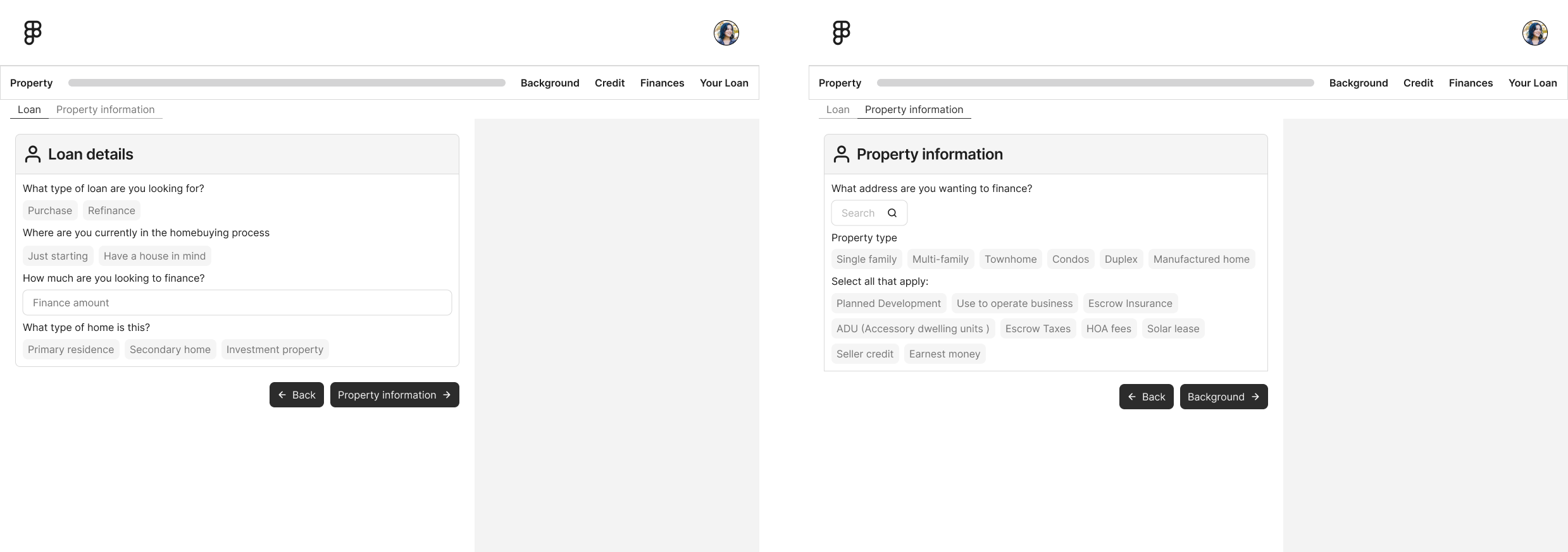
Prototyping
Validating the conversation structure with stakeholders before investing in visual design. Testing structure at low cost is what made the high-fidelity phase an execution exercise instead of a debate.
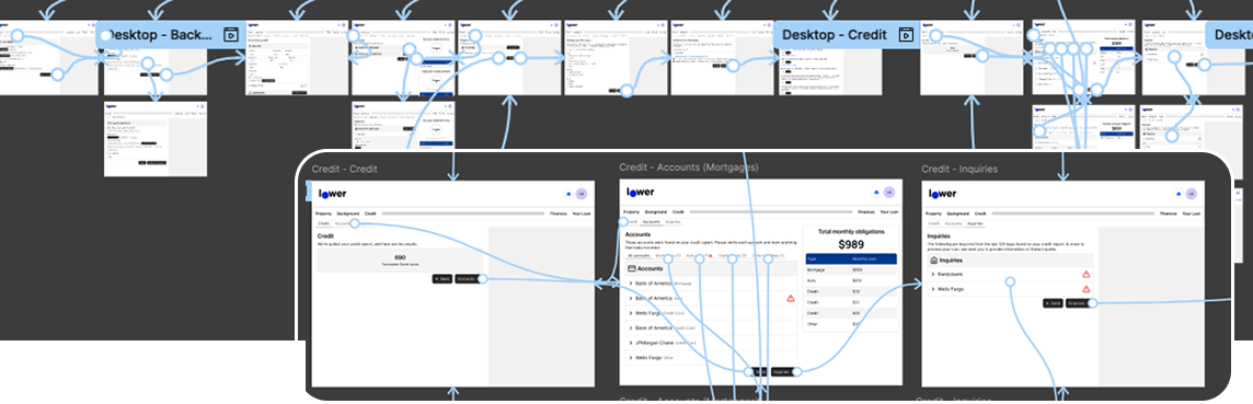
Learning from Low-Fidelity
The Primary Module captures just enough for the system to pull credit, run pricing, and set the LO up for a successful initial consult. Follow-up modules — Income, Property, Additional Details, Military, Liabilities, Documents — each unlock the next phase of the loan (initial disclosures, the 1003, the loan estimate, underwriting). Borrowers give a little, get value back, and the loan team gains flexibility in how they collect the rest. Killing the first version was the most valuable design decision in the project.
High Fidelity Iteration
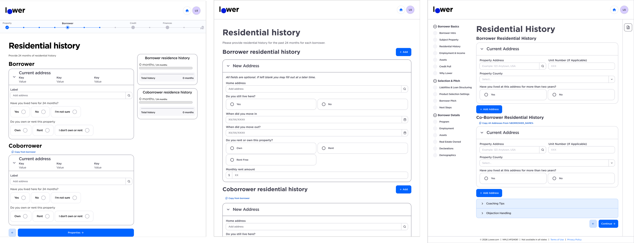
Building It to Scale
A sole designer supporting an entire lending platform can't hand-craft every screen. I invested heavily in systems:
A shared component library used across the platform. When an engineer later built an entirely new government-loan form, every component already existed — no rebuild, no extra design effort.
Adaptable interaction patterns — searchable field groups, filters, drawers — designed once for a specific request, then reused across new use cases.
Configurable by design. I partnered with the platform's staff engineer and chief architect on the config-based flow system — designing components as configurable patterns rather than fixed screens, so a new loan program or question variant ships as configuration, not a custom build. That architectural partnership is why program expansion stayed cheap.
A design-to-configuration translation guide for engineering, documenting how to translate Figma patterns (expandable cards, repeating blocks, conditional sections) into the platform's config-based flow system. This cut design–engineering back-and-forth and stopped bespoke components from creeping in where existing patterns worked.
The guided experience shipped first as an alpha for conventional refinance, then expanded to the next three highest-volume loan products — FHA, VA, and HELOC — with program-specific eligibility questions layered onto the same shared conditional-flow architecture. Designing the architecture for reuse is what made that expansion a design exercise rather than a rebuild.
Working Across the Organization
None of this shipped because of pixels. It shipped because of relationships. As the only designer, I became the connective tissue between sales, engineering, and product leadership — often the one person in the room who had heard all three conversations and could carry context between them.
Product: I partnered with PMs on PRDs, keeping design requirements synchronized between the PRD and the Figma source of truth so neither drifted. I also mentored the product manager who took on the guided experience — bridging what we were hearing at the executive level into framed design requirements she could run with, and establishing day-to-day what a strong product–design partnership looks like: shared context early, honest trade-off conversations, one source of truth.
Engineering: I resolved ambiguity before build — in one pricing workflow review, an engineering leader noted the concerns I raised "would not have been uncovered until a user hit them in a live loan." When feasibility questions came up, I worked through them live and returned an updated prototype the same day.
Sales: I worked directly with the Chief Revenue Officer and his sales leaders — the on-site vision session, ongoing walkthroughs, and feedback cycles folded straight back into the source of truth — and used a pilot loan team as early validators.
Marketing: I acted as the bridge between brand and product — aligning the consumer funnel's patterns with LowerOS early to prevent long-term divergence, and governing a unified design language across the marketing site, the borrower funnel, and the lending platform.
Over two years, I became the recognized point of contact for the borrower-facing platform — the institutional memory for what had been demoed, what had been decided, and why.
AI as a Force Multiplier
Being the only designer on a platform this large meant every hour of manual work had a real cost. Midway through the project I made AI a deliberate part of the process — not as a novelty, but in three phases: learn it, operationalize it, then govern it.
Learn
I started with formal training (Nielsen Norman Group's AI in Design Workflows) and translated it into an executive summary for the organization with four concrete commitments: AI-assisted rapid prototyping, design-system analysis, research synthesis, and design-critique assistance. The framing I set then held for everything after. AI accelerates exploration and ideation, but human judgment owns reliability, taste, and strategic alignment. Prompting works like directing a junior designer: iterative and only as good as the context you provide.
Operationalize
AI moved from experiment to infrastructure in the day-to-day delivery process:
Research synthesis at scale. Clustering pain points from borrower call transcripts and loan-officer feedback, and condensing competitive analysis into stakeholder-ready insights — work that previously consumed the hours I needed for design itself.
Grounded exploration. Conversational AI prototyping (anchored to the existing component library, not free-styled) let me generate screen variations and copy for the LO experience quickly, react, and discard cheaply. When engineering raised feasibility concerns on a flow, I worked through them live in a 30-minute call and returned an updated prototype the same day.
AI-assisted handoff. I redesigned the design-to-engineering handoff and piloted it on the guided experience: per-ticket design pages linked from the ticket, Figma Dev Mode for specs, an AI annotation assistant to eliminate manual page setup, and Code Connect experiments mapping design components one-to-one to coded components. The pilot directly targeted the three root causes of handoff friction from the alpha: unfamiliar files, undocumented states, and design/ticket drift.
Writing for machine readers. The design-to-config translation guide was written for two audiences — engineers and AI coding agents — mapping design patterns (expandable cards, repeating blocks, conditional sections) to the platform's existing config shapes so that generated code lands on real components instead of bespoke one-offs.
Govern
As AI design tools multiplied, I authored the organization's rules-of-engagement playbook: which generator to use for which job, the design system as the quality gate separating "near-shippable" from "throwaway mockup," green-light lanes where PMs can explore without a designer, and hard red lines — novel flows, net-new patterns, and anything shipping to borrowers on regulated mortgage surfaces requires a designer. The honest boundary-setting mattered as much as the advocacy: AI-generated design stayed exploration-only until it could be grounded in our system, and I said so plainly to leadership.
The result: one designer kept pace with an engineering organization at a 1:20 designer-to-engineer ratio — not by working more hours, but by automating the repeatable and reserving judgment for the novel.
Outcomes
Shipped and in daily use. The alpha went live with the first cohort of ten DTC loan officers in May 2026, covering conventional and FHA refinance. The VA beta followed in June, with HELOC/closed-end seconds staged ahead of the full DTC-wide rollout.
Loan officers asked to stay. After their first full week in the system, the alpha LOs' question wasn't "how do I go back?" — it was "When can we just work full time in this?" The reason they gave: the speed and automation of the system as a whole.
Borrowers answer questions once. The guided application pre-fills everything previously collected; credit lives in one place, ending duplicate pulls.
One call instead of many. The guided workflow targets 90%+ information capture on the first call, with strong positive feedback from loan teams on reduced friction.
From alpha to three new loan products. The conditional-flow architecture extended from conventional refinance to FHA, VA, and HELOC without redesigning the system.
Engineering velocity. Shared components meant new forms shipped with zero component rebuild; the design-to-config guide reduced implementation back-and-forth.
A shared map of the business. The workflow documentation became the reference product, engineering, and sales leadership used to sequence the platform roadmap.
And the honest part: adoption was not automatic. The one-call workflow replaced a world where every LO had built their own way of working — "choose your own adventure" across a personal mix of tools. Some early feedback was real product friction; some was preference for old habits wearing a usability costume. Separating the two took discipline: the team validated problems before reacting to preferences. This is exactly why the executive and sales-leadership buy-in mattered so much up front — when friction surfaced, leadership wasn't surprised or reactive. They were part of the rollout, helping triage what was a bug, what was a training gap, and what was simply the cost of change.
What I Learned
Domain depth is a design tool. The most valuable design artifact in this project was a field mapping spreadsheet-style audit, not a screen. Understanding mortgage mechanics — credit, pricing, AUS, disclosures — is what let me design a system where information flows instead of evaporating.
Design the data continuity, then the screens. "Don't make the borrower repeat themselves" sounds like a UX-copy problem. It's actually a systems problem — and once the system guarantees continuity, the screens almost design themselves.
When you're the only designer, systems are survival. Component libraries, translation guides, and documented decisions are how one designer supports an entire platform — and how the work outlives any single project.
Executive buy-in is a design deliverable. A workflow change this large doesn't survive on usability alone. The on-site with the Chief Revenue Officer and his leaders wasn't a status presentation — it was the moment the organization agreed on which future we were designing. Every hard conversation during rollout was easier because that agreement already existed.